



Empathise
Clarify
Brainstorm
Develop
Validate
Going to the problem root
Research and interviews
Validate if the ideas worked
Design and build solution
How is the problem currently addressed
Analyse your feedback
Flows, sketch and diagram
Does the design solution solve the problem
Getting to the goal with first testing
Iteration based on feedback
Usability Testing
VR2 iteration based on usability testing
Final design & future feature
How might we help improve the situation
Aligning solution to research
DigiHealth is a proactive healthcare platform, empowering users to prioritise their well-being through preventive measures. Stay ahead of health concerns with personalised resources and expert guidance.
d
I
I
g
h
e
a
l
h
t
In places like Nigeria, many people may not have easy access to healthcare information or resources, and health issues often go unnoticed until they become severe. This project is looking at these challenges and thinking about ways to help.
Going to the root of Nigeria health system
The problem
EMPATHISE

Many routinely miss or ignore their body’s warnings about the onset of a serious chronic disease or are unable to receive preventive care due to social or economic barriers.
UNICEF said in a recent report that “preventable or treatable infectious diseases such as malaria, pneumonia, diarrhea, measles, and HIV/AIDS account for more than 70% of the estimated one million deaths in Nigeria”.
How is this problem currently solved
What are other companies in Nigeria doing to help with this issue?
From my research, I found out that Nigeria doesn't have enough resources or platforms to handle this issue. There's hardly a single website providing personalised health solutions for people.
I didn't let that stop me from moving forward. I thought creatively and searched for competitors beyond Nigeria's demographics. I compared the features, strengths, and weaknesses of four personalized health websites. This helped me get ready for user interviews by understanding what resources our users already had.

Key Notes I learnt from the competitive analysis
From my analysis, I learned the importance of accurate food databases for calorie tracking from MyFitnessPal and the need for integrating mental health resources from Tebra. Dr. On Demand highlighted the value of telemedicine services, while Healthline emphasised engaging health content.
Additionally, I noticed common weaknesses, such as inaccuracies in food databases and limited mental health resources. These insights guide my decisions in enhancing our product's functionalities and addressing similar weaknesses effectively.

I believe I need to clear things up and listen to what users have to say
Clarify
Finding the Problem
Interview Strategy
Mapping out Patterns
Grouping Patterns into Categories
Painpoints Identified Through Affininity Mapping
Interview
Assumption and Risk
Target Audience

"Planning is bringing the future into the present so that you can do something about it now."
Alan Lakein
Interview Objectives
Identify prevalent health issues in Nigeria, focusing on issues that often go undetected.
Evaluate the level of digital literacy within the Nigerian demographic to identify potential barriers to accessing health information and resources.
Evaluate technology adoption for preventive healthcare.
Understand the patterns of health-seeking behavior, including factors that prompt individuals to seek medical attention and those that hinder timely healthcare engagement.
To know the current health practices and habits among the Nigerian population, by examining both positive and negative behaviours related to preventive healthcare.

"In the face of uncertainty, there is nothing wrong with hope as long as it doesn't keep you from planning for risk."
Brennan Manning
After setting a clear objective for the interview, I considered potential risks that might affect its success or make participants uncomfortable, and I prepared to address them.
Assumption: Assuming widespread digital accessibility may not hold true, and busy people may not have time for moderated interviews.
Risk mitigation: Implementing diverse recruitment methods, including offline channels by meeting with people in person, also drafting detailed survey questions that meet all the needs and questions I intend to ask, this will help to ensure representation from individuals with varying levels of digital access.
Assumption: Assuming that individuals will not openly discuss their health challenges because of the fear of societal stigma.
Risk mitigation: Ensuring participant confidentiality and anonymity in interviews and surveys, creating a safe space for open and honest discussions.
Assumption: Assuming I will have challenges in reaching diverse communities for interviews
Risk mitigation: Building strong community connections by telling people to also share the survey with their network.
To ensure I interviewed the correct users, I identified potential target users who would benefit from the product.
Users with a family history of chronic diseases.
People who find interest in living a healthy life.
Older adults who may have unique health needs and preferences
Users managing chronic diseases, whether new or long-standing.
Key Notes I learned from planning before conducting interviews.
The planning process before conducting interviews taught me valuable lessons.
By setting clear goals and objectives, identifying potential risks, and defining target users, I gained valuable insights.
This preparation not only helped in addressing users effectively and asking relevant questions but also in creating a comfortable environment for participants. Overall, this process facilitated informed decision-making and guided me forward in the interview process.
Meeting with the Interviewees
I conducted both qualitative and quantitative analysis research. I did a moderated interview for 6 people and I was able to gather 60 responses from my survey questions.


After interviewing participants, I reviewed recorded interview responses and used sticky notes to capture key points from each participant's feedback.

Summarised key notes from both survey and moderated interview
Gender & Age
78% are age between 20-40 followed by age 50 and above.
66% are mostly Female.
78.4%
23.6%
Health Issues
70% Majority are currently nursing health crises
70%
30%
Access to care
66% of people lack easy access to healthcare, while the remainder have only moderate access.
66%
34%
Health Awareness
The majority depended on visiting the hospital to obtain firsthand information about their health or symptoms, while others turned to Google for information.
55%
45%
Focusing on the need and not the assumption

Having compiled insights from each participant, I proceeded to discern patterns and recurring issues that exhibited similarity across the responses. This process involved systematically identifying common themes and trends to gain a more comprehensive understanding of the prevalent challenges and concerns expressed by the interviewees.

After identifying recurring patterns in the responses, I proceeded to categorize each observation. This involved systematically grouping related insights into distinct categories, allowing for a more organised and nuanced understanding of the prevalent themes within the interviewee feedback.

Following the categorisation process, I further refined the analysis by summarising each category into a distinct problem. This step aimed to streamline the complexities inherent in multiple observations, making it easier to distill and comprehend the key issues identified during the interviews.

Key Notes I learned from affinity mapping
I studied various articles and guides to grasp the concept of affinity mapping and effectively apply it to this project
From affinity mapping, I learned how to organise and group diverse data and insights gathered from interviews and research into meaningful categories. This method helped in identifying common themes and patterns, enabling a clearer understanding of the main problems faced by users.
I started turning problems into opportunities by making a "How Might We" (HMW) and a related Point of View (POV) statement. This method helps me look at problems in a new way, coming up with creative ideas and finding good solutions.
How might we help ?
POVS & HMW

Opportunities are usually disguised as hard work, so most people don't recognise them."
Ann Landers

Flipping problems into opportunities
Crafting a Persona
In other to help bring user needs, goals, and behaviours to life, I created a persona to make informed decisions based on their perspective. This helps to provide a focal point for design decisions, ensuring that the final product meets the needs and preferences of the intended users.

Flipping solutions into ideas
Creating a Mental Model
Sketching out design ideas
Testing the Functionality of the Design Solution
I adopted analogous inspirational tools, did another round of competitive analysis that involves identifying who else is solving the same problem in industries and how they use their special features to achieve the goal.
After collecting insights from the extra competitive analysis, I began brainstorming various ideas to address each problem.
Impactful Ideas
Turning HMW into ideas
Zocdoc
Teladoc
Lemonaid Health
Maven Clinic
PlushCare
The who
Zocdoc: Online appointment scheduling, search for nearer location.
Teladoc: Virtual visits with doctors, therapists, and specialists for convenient access to healthcare services from home.
Lemonaid Health: Online consultations and prescriptions for medical conditions.
Maven Clinic: Virtual consultations, health plan, resource centre, testimonials
The How

Does it solve the problem?
I simplify ideas for each problem into ones that are easy to accomplish, and outline how they tackle the main challenges in each problem area.

Using this approach, I managed to condense my final ideas into 5 key features.

Design is not just what it looks like and feels like. Design is how it works."
Steve Jobs
24/7 online virtual consultation
Symptoms checker/ diagnoses
Resource hub for health topics
Add your personal doctor to the platform for follow up
Alarm for reminder
Final Idea
Key Notes I learned from ideated feature
I've realized how this process helps me in crafting innovative solutions. By delving into HMW and Point of View statements, I've learned to channel my thoughts into actionable insights. Drawing inspiration from analogous approaches.
Ultimately, this process has empowered me to craft solutions that not only address user needs but also spark meaningful change.
Content Strategy
Brainstorm
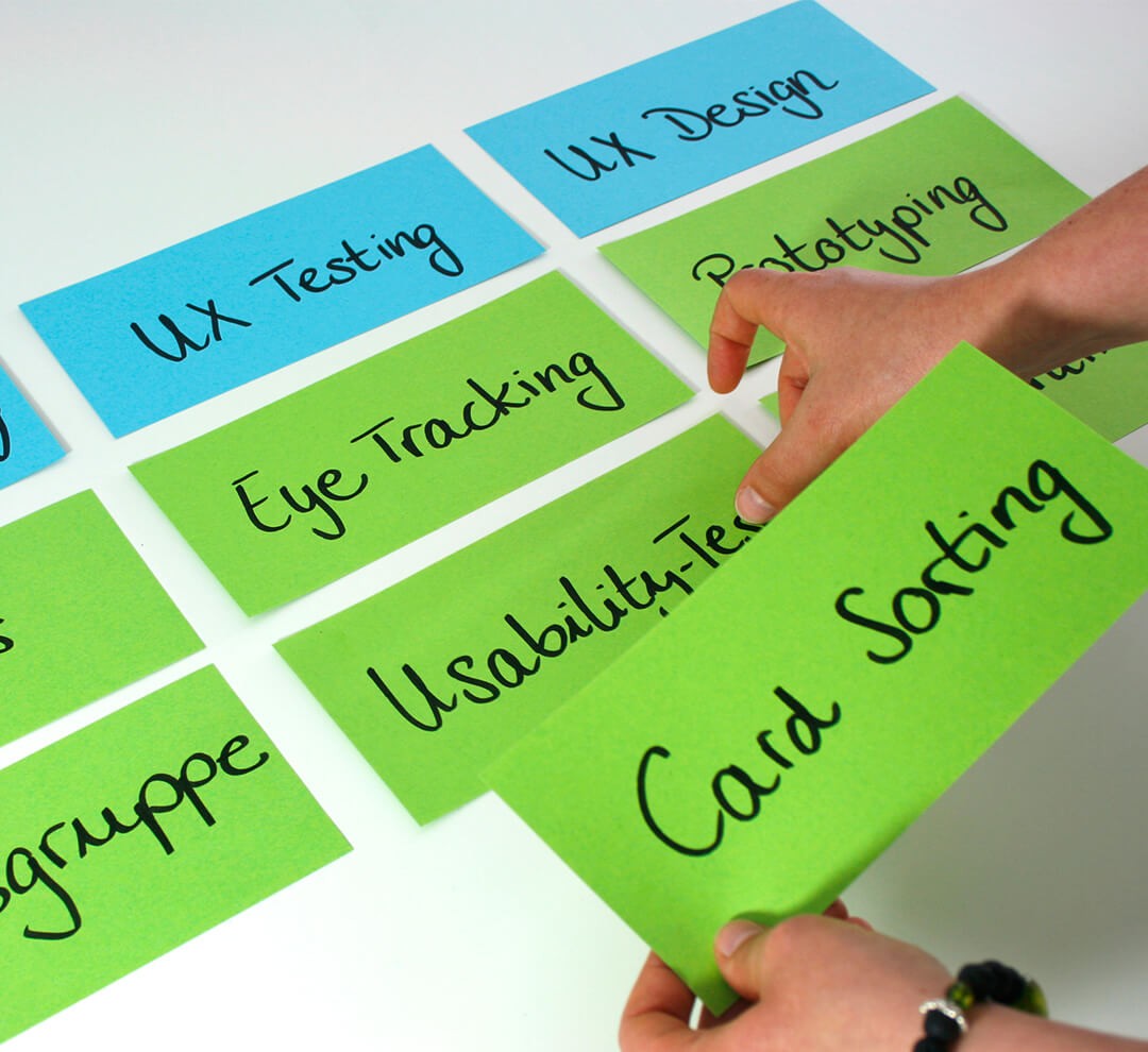
Card sorting analysis
I moved to the stage of identifying how users group words on cards into categories in a way that makes sense to them, this will help me make sure the information architecture is placed where it can be easily identified.
I carefully curated a set of 50 cards, presenting participants with a diverse array of terms related to preventive preventive health care.

Result
All participants unanimously grouped fitness and exercise under the lifestyle, 80% associated vision, dental, medication, and prescription with the insurance category . Similarly, 83% linked long-term care and preventive medication to the check-ups category, indicating a consistent pattern in how participants perceived and organized these concepts.
Sorting with Participants
Ambiguity in words
Six participants was engaged in the process of grouping various words into categories
The card sort revealed the necessity for clearer labels and wording for categories and topics, initiating UX iterations in the project's development process.

Key Notes I learned from card sorting feedback & insights
The feedback and insights gathered from the card sorting activity provided valuable perspectives on how participants mentally categorise health-related concepts.
Agreement on groupings like fitness under lifestyle suggests common associations. Differences in preferences offer insights into individual perspectives, aiding information architecture decisions.
Reflection
Reflecting on the overall project for preventive healthcare, it was a valuable journey that emphasized the importance of user-centered design, iterative refinement, and clear communication to create a more effective and accessible solution for managing health concerns.
The process involved addressing user feedback, simplifying interactions, and correcting design errors, leading to a more intuitive and reliable tool. Ultimately,
I successfully solved the problem of users struggling to find relevant medical professionals and manage their health concerns efficiently by creating a streamlined platform that facilitates easy access to healthcare resources and personalized symptom analysis.
Putting into consideration the mental perspective of how participant group words into categories they are familiar with, I created a first version of site map
Sitemap Diagramming
User Journey
After completing the site mapping, I proceeded to create the first version of the user journey, taking into account how participants mentally categorize and group information.
After mapping out the site, I started sketching the initial design. I thought about how users group and understand information to make the design easy to use. These sketches helped me explore different layouts and ideas, setting the stage for the final design and user experience.
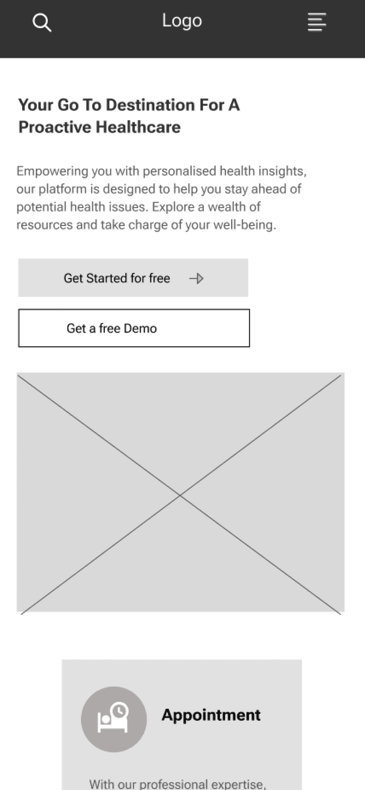
After sketching the layout, I moved on to creating low-fidelity prototypes. These simple, basic versions of the design helped me quickly test and refine the layout and functionality. By focusing on the core structure without getting bogged down by details, I could easily identify what worked well and what needed improvement.
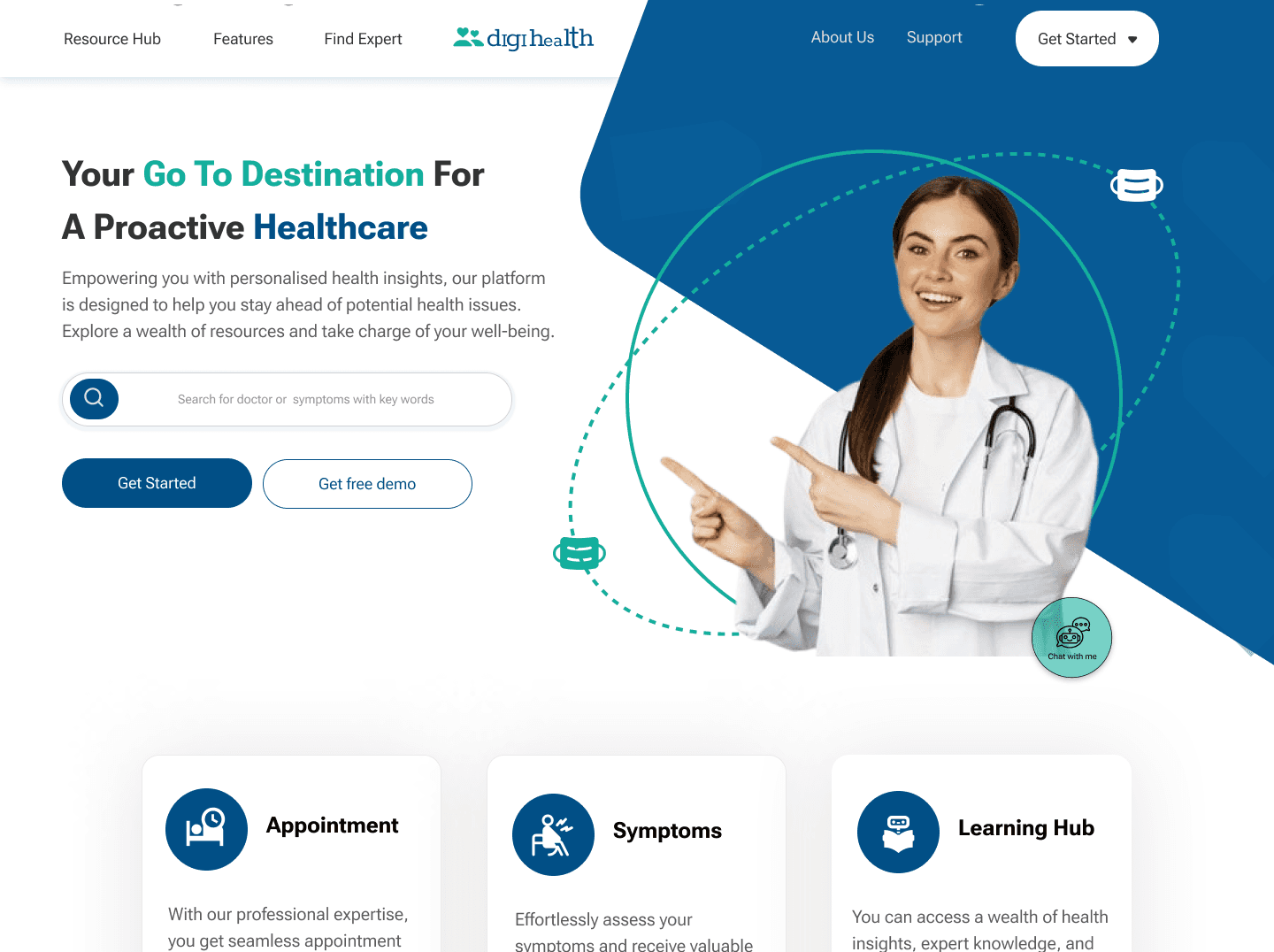
After creating the low-fidelity prototypes, I proceeded to develop high-fidelity versions. These detailed and polished designs included real content, colors, and interactive elements, providing a realistic view of the final design.
After I finished with the high-fidelity design, I conducted usability testing for both web and it responsive app by interviewing 5 people. I created a research plan and drafted a testing plan to guide the process. This helped me gather valuable feedback and insights to further refine the design and ensure it was user-friendly and effective.
I got a lot of feedback from the usability testing based on the following flow task:
Sign Up to the Website
Searching and Booking Doctors Appointment
Checking Symptoms
Setting an Alarm for Upcoming Doctors Appointment
The testing results provided valuable feedback, revealing that users found the design intuitive and easy to navigate, but highlighted areas for improvement
The completion rate for the first two tasks was 100%, while the third and forth task had a completion rate of 83.33%. These insights guided the iterative process, resulting in a more intuitive and user-friendly final design.
I got a lot of feedback from the usability testing, with the majority focusing on simplifying certain interactions to make the user experience smoother, enhancing the clarity of instructions, and adjusting the layout to better meet user expectations.
To address this feedback, I developed a Feedback Matrix to identify the most critical revisions. I prioritized these revisions by counting how often each issue was mentioned by individual users. This approach ensured that the most frequently reported concerns were addressed first, leading to more effective and targeted improvements.
Sketch
Usability Testing
Results
Iterations
Other Case Study
User Feedback
Prioritising Feedback for final Iteration
Low Fidelity Design
Desktop Low Fi
HI Fidelity Design
The problem of people having to wait a long time before seeing a doctor was solved by allowing them
to search for and book an appointment with a doctor in their area of concern withiout having to wait.
A streamlined onboarding process that caters to users of all ages and backgrounds




Macbook Pro

Logo
Get Started
Resource Hub
Features
Find Expert
About Us
Support
Your Go To Destination For A Proactive Healthcare
Empowering you with personalised health insights, our platform is designed to help you stay ahead of potential health issues. Explore a wealth of resources and take charge of your well-being.
Appointment
With our professional expertise, you get seamless appointment booking for personalised health consultations.
Symptoms
Effortlessly assess your symptoms and receive valuable insights into potential ailments through our intuitive platform.
Learning Hub
You can access a wealth of health insights, expert knowledge, and valuable information to empower your wellness journey.
Get Started for free
Get a free Demo
Discover And Get A Personalised Preventive Measures Tailored to Your Unique Health Journey
Experience personalised preventive healthcare on our platform, where we tailor measures to address your unique health profile and goals.
Whether it's personalised nutrition plans, fitness routines, or expert advice, we are committed to guiding you on a health journey that suits you best.
Embrace a proactive and individualised approach to wellness with our comprehensive range of personalised preventive measures.
1
2
3


Dr Richard Williams
Diabetes specialist

Dr Racheal Thoms
Cancer specialist

Dr Hafsoh Omolola
Therapist specialist

Dr Folarin Temitope
Cancer specialist

Dr Halimah Robbert
General medicine specialist

Dr Sofiyyah Adeniran
Amnesia specialist

Dr Sofiyyah Adeniran
Amnesia specialist

Dr Sofiyyah Adeniran
Amnesia specialist
Our professionals are passionate experts dedicated to your well-being and vitality.
With a commitment to your well-being, our experts deliver personalized care and advice virtually, ensuring a seamless and impactful experience. Your health is our priority, and we are here to empower you with the expertise you need for a healthier life
Book A Session

A Nutrition And Fitness Tracker Just For you
Skip the Lines, Begin Your Healthcare Journey Anywhere You Are
Effortlessly track your diet and maintain optimal sugar levels with our Nutrition and Fitness Tracker, ensuring a personalised and healthy lifestyle tailored to your well-being.
Experience healthcare at your fingertips, anytime, anywhere. Skip the queues and connect with experts on your terms. Follow these simple steps to begin your journey.
What You Get And How It Works
With intuitive functionalities like personalised meal recommendations, calorie tracking, and nutritional analysis, achieving and maintaining your health goals has never been easier.


Dashboard
Fitness / Exercise
Nutrition and Calorie Tracker
Answer onboarding questions, set health goals, and unlock a personalised dashboard for effective tracking and achievement of your wellness objectives.
Stay motivated and receive timely insights on achieving your fitness goals with personalised alarms and exercise guidance
Scan and check the calorie and sugar content of your food to get accurate information aligned with your health goals.

Ease Your Concerns And Discover the Medical Meaning Behind Your Symptoms.
Uncover the precise medical reasons behind your symptoms by answering a few simple questions, providing you with valuable insights and understanding without unnecessary worry.
Check your symptoms
Book Your Appointment Now
Enter your email
Subscribe
Reserve your spot Today
Search
Type your concerns with key words
Find specialists tailored to your specific medical needs.Do not worry, we have you.
Search for Expert

Select your preferred medical specialist based on their outstanding reviews and testimonials
Choose Preferred Expert

Schedule at your convenience, choosing the time and date that suits you best.
Book Your Appointment

Explore Our Pricing and Subscriptions
Unlock a world of health benefits by subscribing to our affordable plans. Prioritize your well-being with our subscription plans and embark on a journey to a healthier, happier you.
Free
$ 0.00 / mon
Enjoy Limited access
Platform is free with limited features but consultation fee apply.
Starter
$ 10.00 / mon
Subscribe Now
Recurring monthly payment, cancel anytime.
Premium
$ 50.00 / Year
Subscribe Now
One time payment
Most Popular
Features
Features
Features
What you will enjoy for free.
What you will enjoy for starter.
What you will enjoy as premium user.
Search various expert of your choice
Search various expert of your choice
Search various expert of your choice
Book expert appointment
Book expert appointment
Book expert appointment
Set Alarm
Set Alarm
Set Alarm
Limited access to learning hub
Symptoms Checker
Unlimited access to learning hub
Symptoms Checker
Personalised Dashboard
Personalised Dashboard
Nutrition guide
Nutrition guide
QR code scanner
QR code scanner
Unlimited access to learning hub
Symptoms Checker
Personalised Dashboard
Nutrition Guide
QR code scanner
Invite your specialist
Invite your specialist
Invite your specialist
Unlimited messages
Unlimited messages
Unlimited messages
Calorie and sugar tracker
Calorie and sugar tracker
Calorie and sugar tracker
Frequently Asked Questions
Explore common queries and find quick answers in our Frequently Asked Questions. Discover insights, troubleshoot, and make the most of your preventive health journey with ease
Is the platform free for new users
Can I trust the symptoms result and take action on it
Is the calorie tracker accurate
Can I invite my physician to my dashboard
Do you accept instalment payment
What type of payment card do you accept
Access valuable guidance and tips on various health issues for free. Subscribe to receive regular educational content tailored to your well-being journey.
Get Free Guidance and Tips to any health issues. Take charge of your health today!

Chat with me

Logo
Get Started
Resource Hub
Features
Find Expert
About Us
Support
Get Started / Sign Up
Begin your journey by signing up and answering our onboarding questions to kickstart the experience. you will never regret.
What is your preferred name ?
Type your name here and click continue
Continue
Logo
Get Started
Resource Hub
Features
Find Expert
About Us
Support
Get Started / Sign Up
Begin your journey by signing up and answering our onboarding questions to kickstart the experience. you will never regret.
What is your primary health goal ?
Fitness / Weight Loss
Taking Medication On time
Keeping Track of My Blood Sugar
Nutrition / Calorie Tracker
Staying Healthy
Other feature
Continue
Users who do not know about their ailment until it gets severe are solved by analyzing
their symptoms to give them a heads-up before confirming with a physician.


Dropdown In Search Bar
This choice confused users, as they expected a simple search function rather than additional options. It disrupted the user experience, making the interface less intuitive and harder to navigate.
Simplifying Language
Users found the phrase "get personalised symptoms" confusing and they did not easily grapes what it means.
Doctor instead of Expert
The term "Find Doctor" was more straightforward and immediately conveyed the purpose of the feature, whereas "Find Expert" was vague and less intuitive.
Sign-Up and Sign-In
Combining "Sign Up" and "Sign In" in Grt Started confused users, requiring them to click twice to log in instead of once.
Doctor instead of Expert
Correcting these errors improved the clarity and professionalism of the content, ensuring users could easily understand and trust the information presented


