Other Case Study
I bring valuable experience and a dedicated mindset to any project. Let's join forces and make a positive impact together. Feel free to reach out to me via my Email or LinkedIn
Feedback Review / Revamp
Based on the valuable feedback received, we diligently addressed the areas of improvement to create a better version of our product. We conducted a thorough review and rectified the numerous typographical errors, ensuring a polished and error-free experience for our users.
Additionally, we revisited the content and made significant enhancements to make it more compelling and persuasive, effectively conveying the value proposition of our product. We also took into account the initial user confusion and redesigned the website and app interface to provide a clearer and more intuitive understanding of its purpose and functionality.
These improvements have resulted in a refined and enhanced version of our product, aligning it more closely with user expectations and delivering a seamless and captivating experience for all users.
Here is the comparison of the public profile design before and after testing, showcasing what users will see when they tap the card on their phone.


Testing Phase
Usability Testing
I conducted a user test with 20 participants who belonged to our target demographic, using prototypes of both the Public App and Website design. This user testing process was crucial in ensuring a better outcome that addresses the user's problems and needs effectively.
By gathering feedback and insights directly from users, we were able to identify areas of improvement and make informed decisions to enhance the product's usability and overall user experience.
Negative feedbacks
Positive feedbacks
Typographical errors were found.
Wao, I like this kind of innovation, Its so intriguing
So thoughtful, it has lot of features.
Even with the plain card, i feel like a rich person using it to connect
Very easy to impress a girl you want to talk to
I wont have to buy 100s of paper card again, one card that works for all
The content lacks persuasiveness and fails to convey the intended message effectively.
For the first time on the website, at a glance I cant figure out what the web or app is all about

Purchase of card from the app at the nav bar

Card information, Shipping details and Order summary

Yor order history, Referral earnings & Settings

Customise Your Impressions with Bleanq's App Screens Below

Splash screen, Log-in & Sign-in page

The app provides you with complete control over the information you wish to share with your connections, allowing you to easily edit and add extensive details as desired.
User have the flexibility to toggle and choose which sections you want to display on your profile. Additionally, the catalog section allows you to showcase your goods and services.
Other links to display in your profile

Bamboo customisation card
Bamboo plain card
Bamboo cards


Plastic plain white card
Plastic plain black card
Plastic customisation white card
Plastic customisation black card
Plastic cards
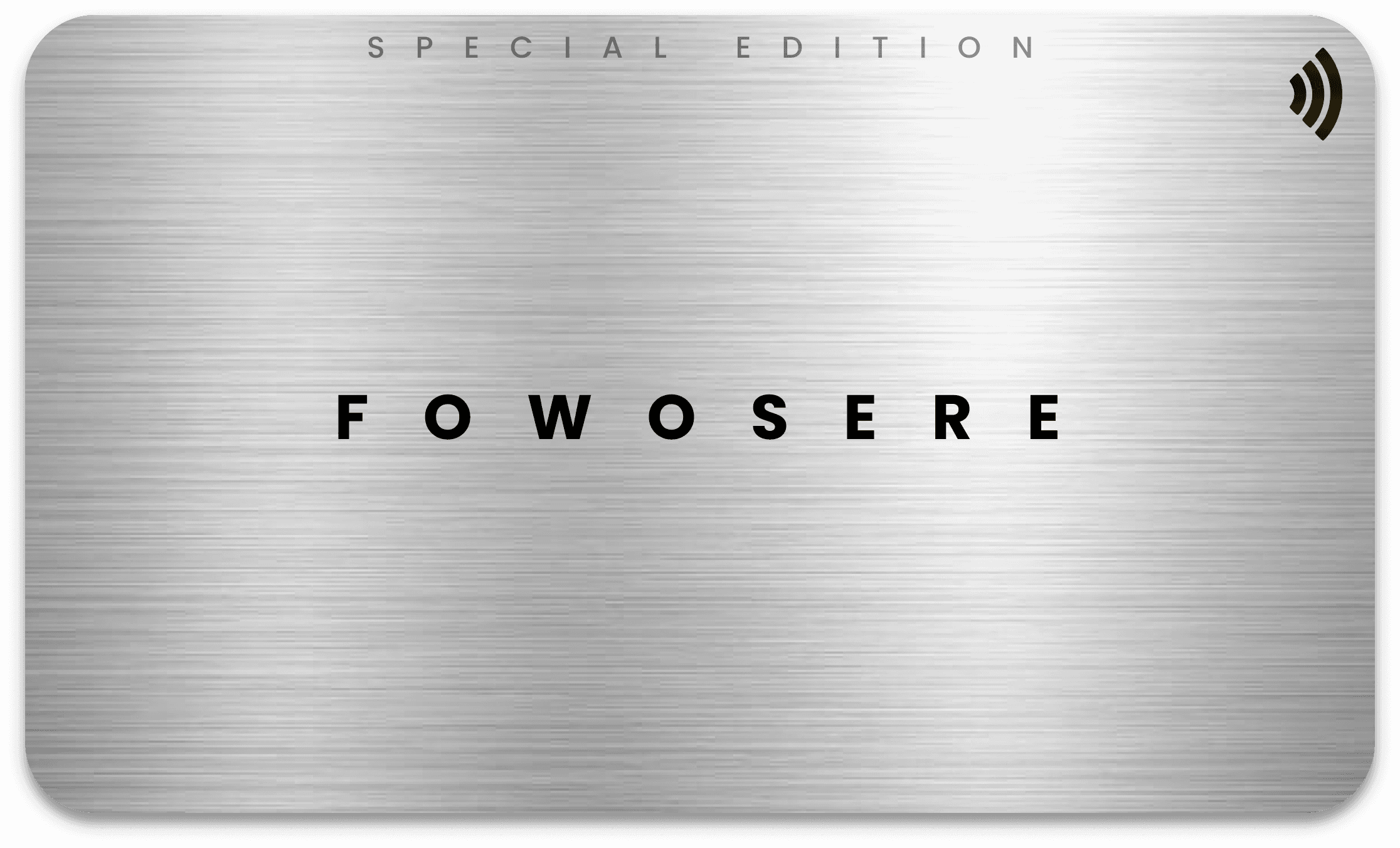
Metal plain silver card
Metal customisation silver card
Metal cards


Bringing Design Concept to Live
Working Prototype
The Networking Business Card
Once I organise all my insight in the ideation stage, I then began to to sketch my idea using the user flow as a guide. This allow me to quickly explore several concept of the application layout. . I then tested it with 3 participant to validate whether the solution address both the general and business needs before finalising.
This is the public profile that others will see when connecting with you. We’ve designed two distinct interfaces tailored to the card you purchase, ensuring you receive maximum value for your investment.
The Gold version offers a premium experience, exclusively for users with the Gold card, enhanced with a luxurious touch of gold to signify exclusivity and sophistication. The second interface is designed for general users, with the only difference being the colour scheme, maintaining the same seamless functionality across both versions.
Based on our survey and research findings, the majority of users expressed a preference for a simple yet aesthetically pleasing card design. To meet this demand, we created a range of card options including plain and customisable designs that strike a balance between simplicity and uniqueness.
Users can choose from white, black, silver, and gold versions, catering to the preferences of highly classified business professionals. Additionally, users have the freedom to personalise their cards by incorporating their own logos or designs.

Conceptualising the Ideas
User Journey
To visualise the user journey and identify potential pain points, I created user flow diagrams for key tasks within Bleanq. By mapping out the steps users would take to create a digital card, share their contact information, and connect with other professionals, I was able to identify areas where the experience could be improved and ensure a smooth and intuitive user flow.

Synthesising the Problem Into Whole
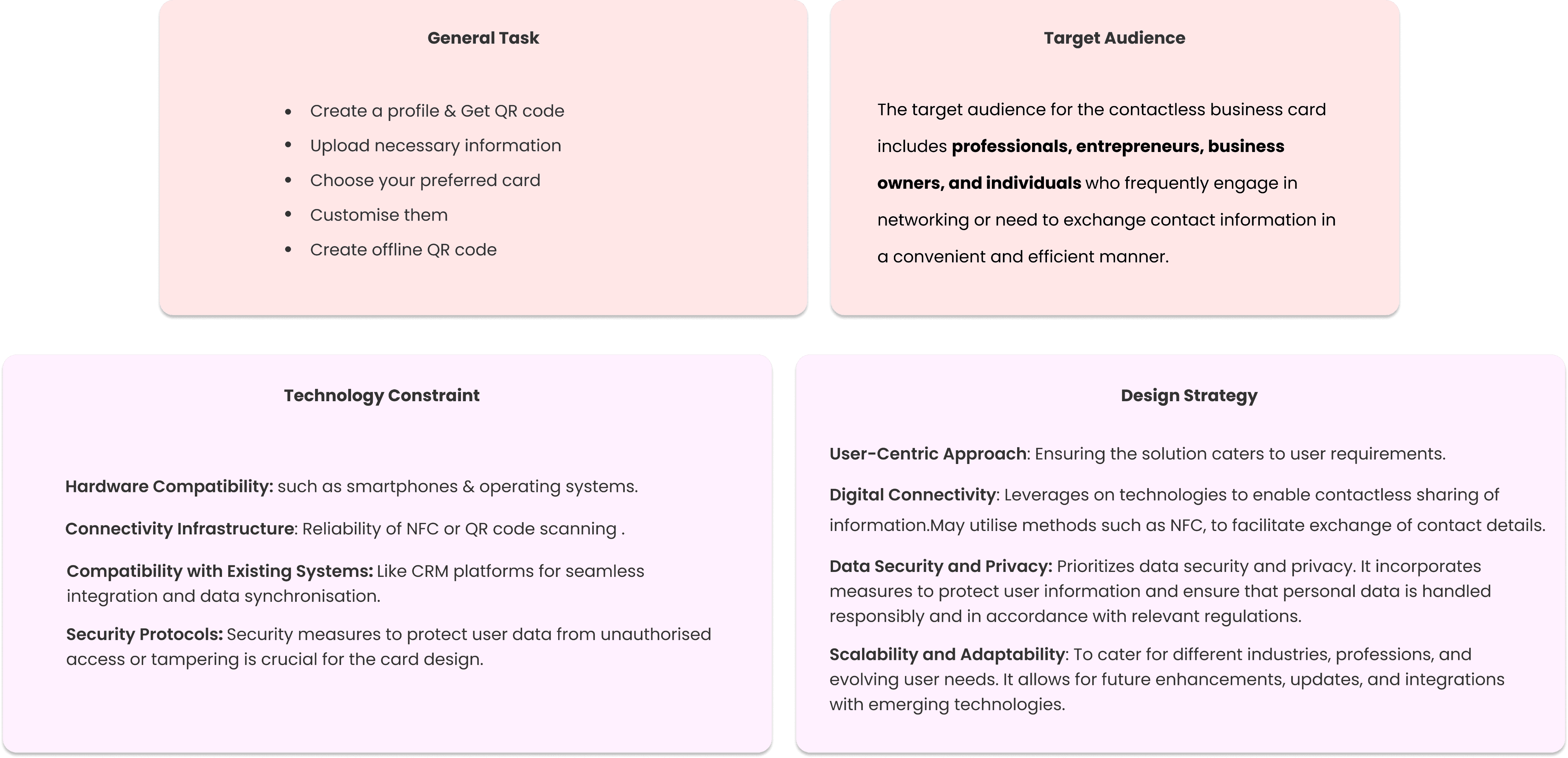
By analysing technical limitations, I ensure the design remains practical and feasible without compromising on user experience. I dive deep into the needs and behaviours of our target audience, tailoring features that resonate with their expectations.
Furthermore, I streamline the overall task flow, ensuring that every interaction is intuitive and aligned with users’ goals.
Bleanq aims to stand out in the competitive digital business card market by solving unique problems that other competitors, such as Ovou, Vice, and Popl, have not yet addressed.
By understanding the limitations of existing solutions, Bleanq aims to provide a superior user experience and offer unmatched value to its users.
The following are features and solutions that Bleanq addresses in the digital world.
Lack of Seamless Integration: Bleanq addresses the lack of seamless integration by providing robust integration capabilities across various communication channels and software applications.
Online Accessibility: While some competitors rely heavily on internet connectivity, Bleanq recognises the importance of offline accessibility by allowing users to access and share digital business cards even without internet connectivity.
Privacy and Security Concerns: Privacy and security are crucial considerations when sharing personal and professional contact information. Bleanq distinguishes itself by prioritising data protection, implementing robust encryption measures, and providing users with comprehensive privacy settings, ensuring that their information remains secure and controlled.
Customise ability and Branding Options: Bleanq acknowledges the importance of personal branding and customisation. Unlike some competitors with limited design options, Bleanq offers a wide range of customisable templates, allowing users to tailor their digital business cards to reflect their unique brand identities and professional aesthetics.
Enhanced User Analytics and Insights: Bleanq understands that professionals need actionable insights into their networking efforts. By incorporating advanced analytics features, Bleanq provides users with comprehensive data on card views, interactions, and engagement. This enables professionals to measure the impact of their digital business cards and optimise their networking strategies for better results.
Balancing Technical Constraints, Audience Needs, and Task Efficiency
Ideated Solutions : Differentiating Bleanq from Competitors in the Digital Business Card Market

The following pain points were identified from the research.

What I've Learned So Far from this approach: A Reflection
Engaging with users early and often is essential to understanding their needs and preferences. Feedback and insights from real users help shape a more intuitive and effective solution.
Balancing Innovation with Practicality: While exploring new technologies and features, it's important to stay grounded in what is technically feasible and aligns with user expectations.
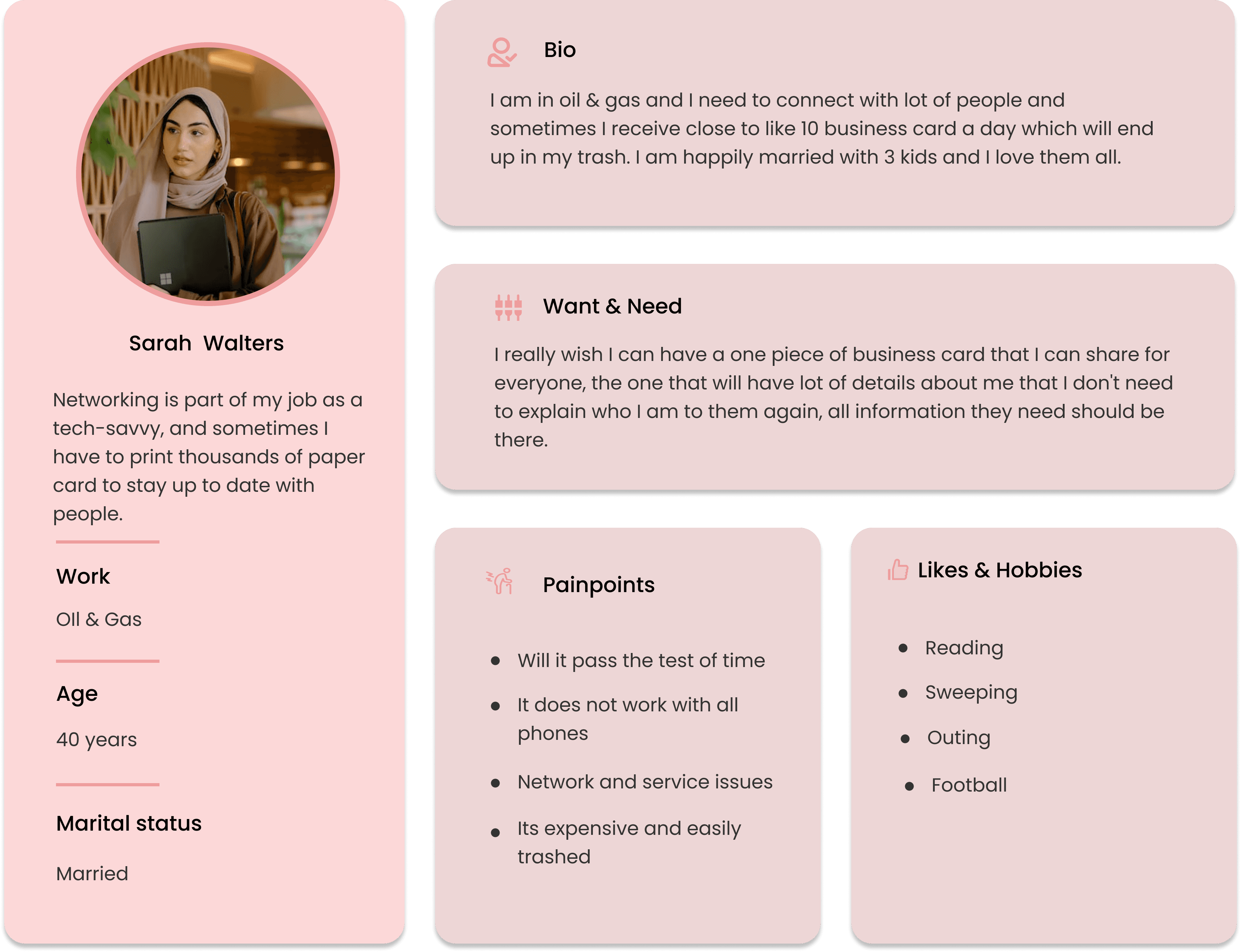
User Persona
Empathy Mapping
To gain a deeper understanding of our target audience and their needs, we created user personas. These fictional characters represent different types of users who might interact with our product or service.
By studying these personas, we can empathise with our users and tailor our design decisions to meet their specific requirements and preferences
I conducted empathy mapping sessions. This technique allowed us to step into the shoes of our target audience and visualiSe their thoughts, feelings, behaviours, and pain points.


Competitive Analysis
Evaluating Existing Solutions in the Market
To gain a competitive edge in the contactless business card space, a thorough analysis of 7 existing products was conducted. This involved assessing features, user experience, pricing models, and market presence of competitors.

Based on the research findings, the following key insights and user perspectives emerged:
Ease of Exchange: Users expressed frustration with the traditional method of exchanging contact information using paper business cards. They highlighted the potential for misplacement or loss, leading to missed networking opportunities.
Digital Business Card Solutions: Users were aware of existing digital business card solutions in the market. However, they found that many of these solutions lacked comprehensive features and did not fully address their needs for efficient contact sharing and management.
Desired Features: Professionals expressed a strong desire for additional features and functionalities in a digital business card solution. These included the ability to customize and personalize their digital cards, easily share them across various platforms and devices, integrate social media profiles, and provide real-time updates
.
User Experience Improvements: Participants highlighted the need for enhanced user experiences in digital business card platforms. They emphasized the importance of intuitive interfaces, seamless navigation, and streamlined workflows that facilitate quick and effortless exchange of contact information.
Synthesising User Perspectives: Key Insights from the Research
Our focus was to dig deeper into the gaps that current solutions fail to address, the functionalities that matter most to users, and the unique features that would set our product apart in a crowded market.
These questions served as the foundation for our design and development process, ensuring that every decision we made was backed by real user insights and aimed at solving genuine problems.
A moderated interview and Google Form survey was conducted to capture user insights on existing products and potential features. With over 200 responses, the data was analysed both qualitatively and quantitatively, providing valuable perspectives that guided the design process and helped address key challenges.
What are the current challenges and pain points faced by professionals in exchanging contact information using traditional paper business cards?
What are the existing digital business card solutions available in the market, and how do they address the needs of professionals?
What features and functionalities are most desired by professionals in a digital business card solution?
How can the user experience of digital business card platforms be improved to enhance ease of use and adoption?
Research
Unveiling Key Research Questions: Guiding Our Path Forward
Research Findings: Gaining Insights into User Perspectives

This platform not only allows professionals to share contact details effortlessly but also integrates a market catalog feature, enabling users to showcase their products, services, and portfolios directly on their digital cards. With real-time updates, customizable designs, and advanced security measures,
Bleanq provides an all-in-one networking tool that enhances connections, supports business growth, and leaves a lasting impression on potential clients and partners.
Solution

The Bleanq Contactless Digital Business Card project aims to revolutionize the way professionals exchange their contact information by eliminating the need for outdated paper business cards. Bleanq is a cutting-edge solution designed to seamlessly connect individuals, allowing them to effortlessly share their professional information while reducing environmental impact.
I led a team for this project and collaborated closely with other developers to bring this project to life. Leveraging cutting-edge technology, Bleanq seeks to redefine networking by offering a secure and convenient alternative to traditional business cards.
The goal of the Bleanq Contactless Digital Business Card project is to equip professionals with an innovative tool that streamlines networking, enhances connections, and makes a memorable impact on potential clients and collaborators across various industries.
I noticed how often people fumble through their wallets for business cards at networking events. It's time-consuming and can be awkward. I wondered if there was a better way to exchange contact information that was more efficient and eco-friendly. That's when I realized the potential of Bleanq.
Based on my observations, I identified the following key problems with traditional business cards:
Overview
Project Goal
Problem

7 Months
Jan -Aug 2022
Myself as UX/ Product Designer
3 other UI Designer
1 Project Manager
1 CTO
10 Developers
3 Marketing Team
End to End Mobile Application
Android/ IOS
User Interviews
UX Analysis
Wire-framing
Design System
Site mapping / Flow
Usability Testing
Design Handoff / Documentation
Figma
Adobe XD
Adobe Photoshop
Adobe After Effect
Morale
Optimal Sort
Duration
Team
My Role
Tools

Simplified networking and stayed connected in the digital age with a smart, interactive business card solution that eliminates the need for physical cards.

Key Take away
Lessons and Takeaway

Throughout this project, I have gained valuable insights and takeaways that have helped shape my understanding and approach. Some key learnings include.
Team Collaboration : The process of constructing this project was highly educational and significantly enhanced my intellectual abilities. Without a competent team, I wouldn't have gained the knowledge and insights derived from this project. The seamless collaboration among team members facilitated mutual learning and growth. The collective effort and shared ideas contributed to our achievement of acquiring nearly 5,000 users and purchases in less than two weeks of going live.
User-Centric Design: Placing the user at the core of our design process is crucial for creating a product that meets their needs and preferences.
Iterative Approach: Embracing an iterative design process allows for continuous improvement by incorporating user feedback and making necessary adjustments.
Balancing Simplicity and Customisation: Striking the right balance between simplicity and customisation is important to provide a user-friendly experience while allowing personalisation.
Continuous Improvement: Launching the product is just the beginning, and continuous feedback collection and monitoring ensure ongoing refinement and improvement.


